
This project uses the Extrasolar Planets Encyclopaedia. You will use this website to create graphs and plots of exoplanet data.
Your task is to try to identify trends or patterns within the plots. The database gives you 36 parameters (or properties) to choose from. This means that if you had the time, you could create 1,260 different graphs!
To start the activity, visit the Extrasolar Planets Plots webpage. Create different graphs and note down what they tell you. There is more information on how to do this below.
It is a good idea to make a prediction before creating a graph. Think about what a particular set of parameters might look like on the diagram before you choose them.
Make sure you read through the information in the project menu. Knowing more about exoplanets will help you analyse and interpret the data.
Using the Extrasolar Planets Diagrams
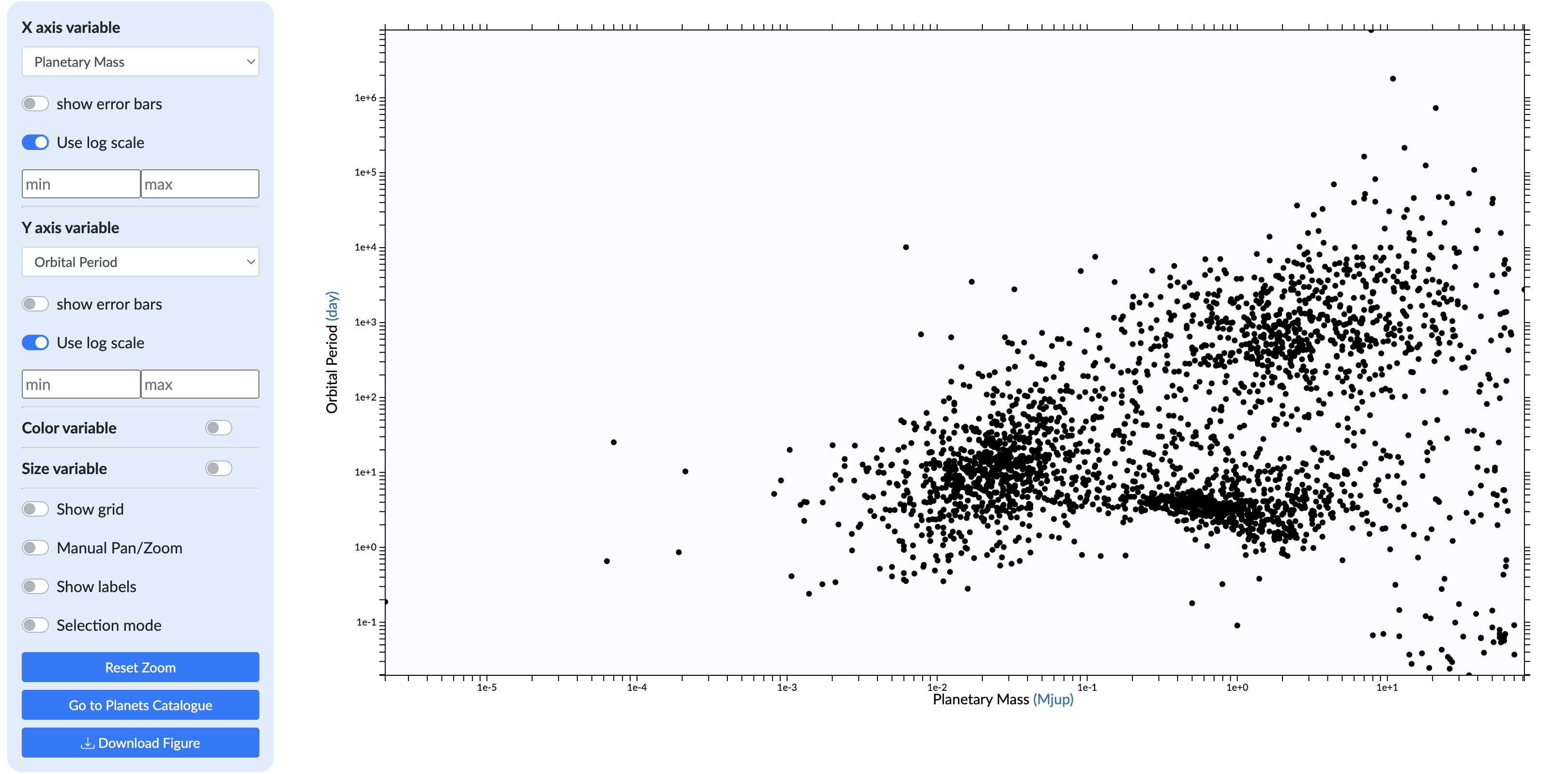
Credit: exoplanet.eu
The X axis and Y axis
You will see a set of options to the right of the graph. These control what data is displayed on the graph and how it is shown. Start by selecting different properties in the dropdown menus under the X-axis and the Y-axis options. You should notice that if you change these, the data displayed on the graph changes.
The log scales
By default, the log scale boxes for each axis are ticked. This means the scales on the axes are logarithmic (rather than linear). This is a sensible way to look at the data if you want to show a wide range of values on a single plot. Try unchecking the boxes to see what happens. Which scale makes the data more meaningful?
Looking for trends and patterns
Your data may fall in a straight line. This tells you both variables are increasing or decreasing at a steady rate. Bear in mind that astronomical data do not always behave perfectly. The data may not all fall on the same perfect straight line.
You can display a straight-line trend by plotting the magnitudes of stars in two different filters. For example, try plotting J against H magnitudes using linear scales. This shows a very clear straight-line trend from bottom left to top right.
Sometimes, the data may show an inversely proportional linear trend. This will show that as the value of one property increases, the other decreases. Why not try to find some examples of this type of trend?
Make sure to look at the values and the units of each scale bar carefully. For example, in astronomy, brighter stars have lower magnitude. So lower numbers represent brighter stars.
Finally, you may create a plot where the data clusters together in clumps. You can see an example of this by plotting the orbital period against the planetary radius. Make sure you use log scales on both axes. Can you see the data clustered in two distinct areas of the plot? What do you think these two areas might represent? Here is a hint: think about the distribution of planets in our own Solar System.
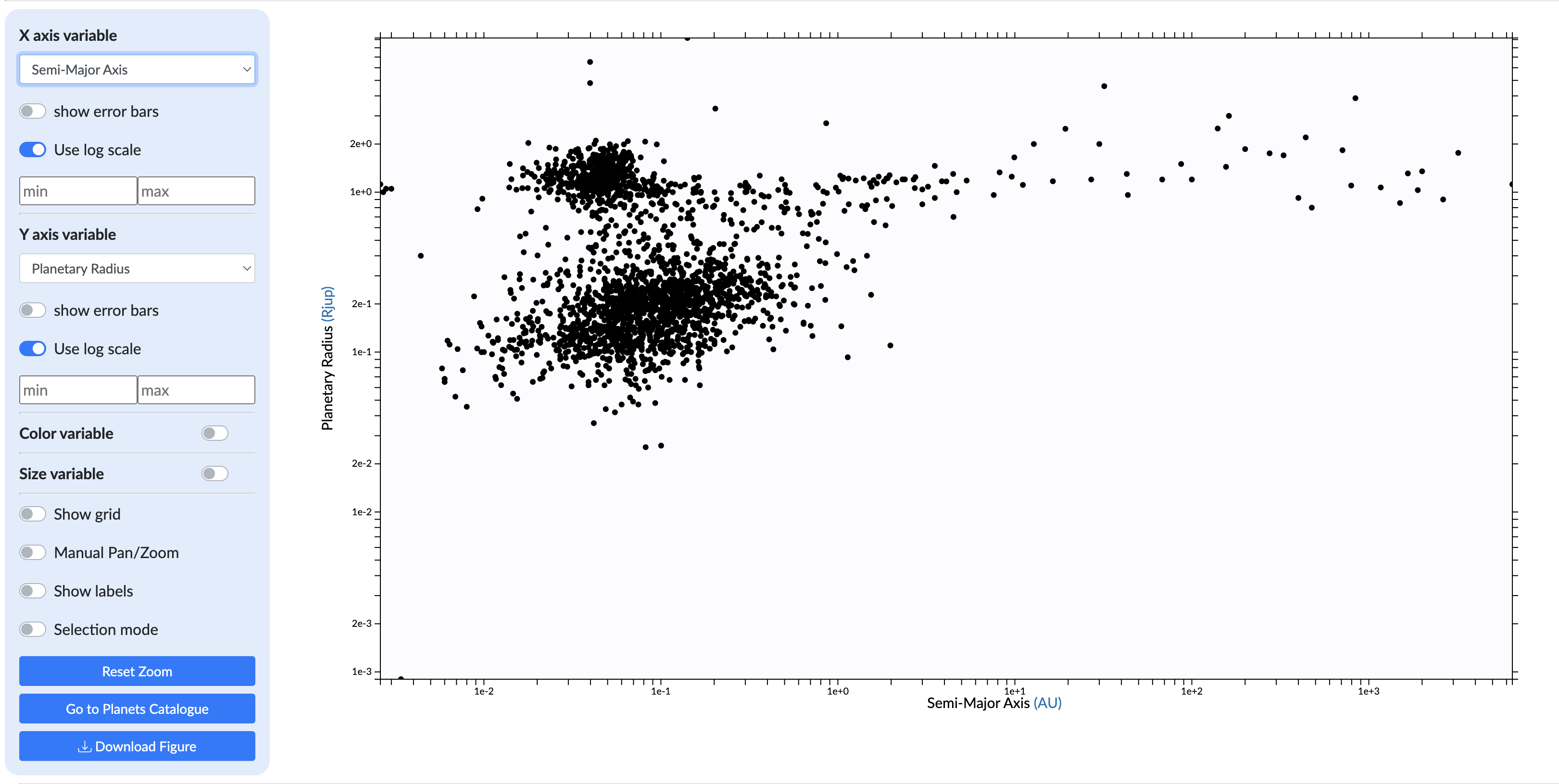
Credit: exoplanet.eu
Selection Effects
During the project, there may be times when you discover what is known as a selection effect. This is a form of bias. A particular choice of data or properties can produce a false idea of what is truly happening.
For example, try plotting orbital inclination (on a linear scale) against orbital period (on a log scale). What do you notice about the data? You should see most of the data share an orbital inclination of 90 degrees. You could narrow your selection to just those discovered by the transit method and most of the points will remain. This tells us that most of the systems were discovered by transit and that most have an inclination of nearly 90 degrees. Have a look at the transit page to remind yourself why this result might be a result of selection bias.
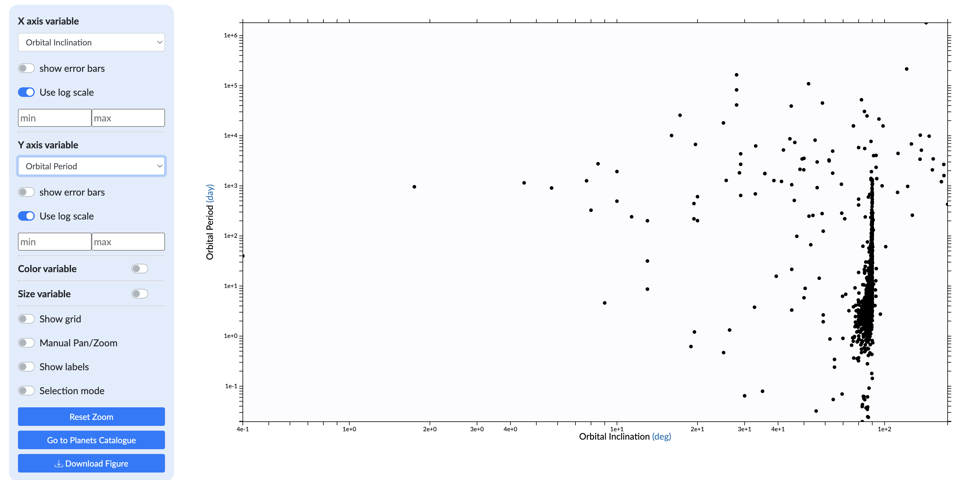
Credit: exoplanet.eu
Another example would be to plot right ascension (RA) against declination (dec). This plots the coordinates of the extra-solar systems. You might expect to see a random distribution of your data. But think about where most of the stars are located in our galaxy. How would this show up in your plot? Can you see any evidence of this in your data?
Look more closely at the data and try zooming in on an area between 35 - 55 degrees of declination and 270 - 310 degrees of RA. What do you notice? You should see a pattern of diamonds displayed on your plot. Does this distribution look random to you? If not, can you identify what's happening here? If not here's a hint: have a look at the names of the individual exoplanets.